The portrait sequence
Images need a sequence
A portrait can catch the eye on its own. An editorial sequence has a different task: it has to carry an idea through several pictures without making every frame compete for the same moment. The strongest opening is not always the closest face, the brightest colour or the most dramatic pose. Sometimes a quieter scene creates room for the image that follows. Choosing the order is a creative decision, as real as choosing the crop.
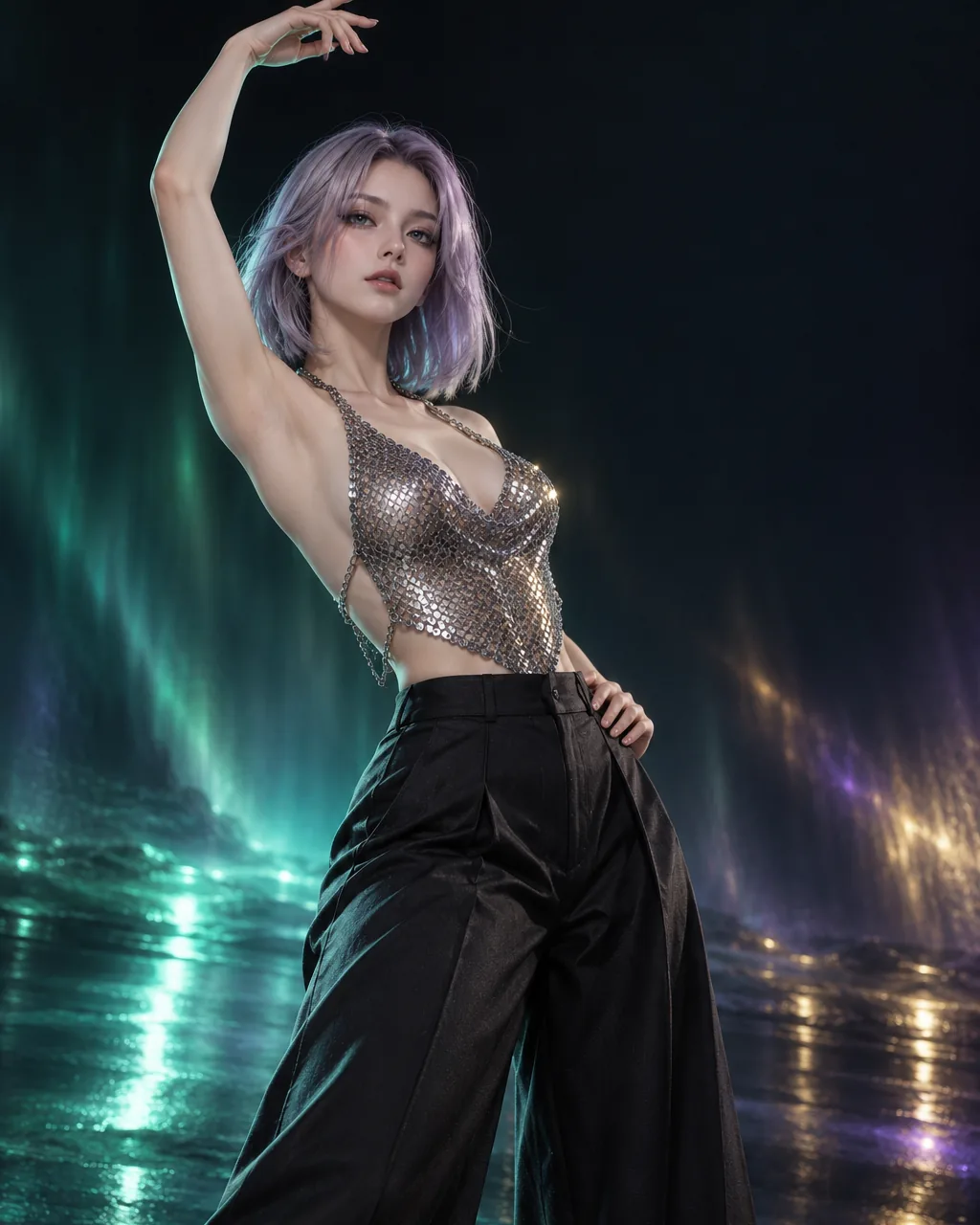
TRENT / THE LOOK explores that decision through fictional adult portraits and practical publishing examples. We discuss the presentation of AI imagery, how to compare visual choices and where a provider reference fits into the conversation. The photographs in this edition are editorial illustrations, not results from our own product testing. There is a little glamour here, but the useful question is simple: what should each picture do for the page?
Follow the sequence from a wider setting to a closer detail. Each photograph has a role, and each role changes the amount of context the reader can see.
Give the opening a job
Imagine an article about evening colour. A fictional figure in a dark setting might make a convincing opening because the surrounding light establishes the atmosphere before any detail is explained. A tightly cropped portrait could be beautiful too, yet it might conceal the very environment the article needs. Select the opening by asking what the reader must understand first. If the answer is the place, show enough place. If the answer is a gesture, give that gesture a clear silhouette.
An opening also establishes a promise about the rest of the feature. A theatrical scene suggests an essay about styling or mood. A restrained, front-facing portrait suggests a closer discussion of expression or composition. Neither choice has a fixed meaning, but the next images should help the reader follow the intended thread. Avoid using an extravagant first frame simply because it is the most decorative file available. An attractive beginning is more useful when the following pages can explain it.

Move closer for a reason
Changing distance is one way to create progression. A wider view introduces the relationship between the figure and the setting. A medium portrait can bring the clothes, posture and expression into focus. A close detail can then isolate the colour or texture that matters to the argument. This is an editorial pattern rather than a rule of photography. Three frames at the same distance can work when they offer a meaningful comparison; a varied sequence can fail when the changes have no purpose.
For a fictional fashion feature, the wide frame might introduce a studio, the middle frame might reveal the outline of a jacket, and the detail might show how a reflective fabric catches the light. The detail earns its place because it answers a question raised earlier. Without that connection, moving closer becomes a visual habit. Write a short role for every proposed image before arranging the page: introduce, explain, compare or conclude. Two consecutive images with the same role may need different captions or a different order.
Let the eye find a resting point
A sequence needs contrast in intensity as well as distance. Strong highlights, saturated colour and an expressive pose can all demand attention. Place too many demanding images together and the page loses a clear centre. A quieter frame can create a pause without becoming empty. Look for a simple outline, a more limited palette or a subject positioned away from the busiest part of the background. The quieter image should still contribute information; it is not merely a space between louder photographs.
The same principle applies to the surrounding design. A large headline beside a complex portrait may make both harder to read. Moving the headline above the image, shortening a caption or removing an unnecessary border can restore hierarchy. Do not ask the image to support text simply because an unused corner seems convenient. That corner may be what gives the figure room to breathe. On a small screen, the relationship changes again: a subtle detail that worked on a wide display may become the whole visible frame.

Choose difference without losing continuity
A collection feels coherent when several decisions hold together. The colour temperature might remain warm while the framing changes. The clothes might vary while the lighting direction stays consistent. The subject can move from an enclosed setting to an outdoor scene if the article explains why that move matters. Continuity does not require every portrait to look like a sibling. It requires enough shared structure for the reader to recognise the intended comparison.
Make the differences explicit in the text. Instead of saying that two images have a similar feeling, identify the repeated colour, the placement of the light or the amount of background. Then identify the change. This makes an aesthetic observation more precise without pretending to measure a provider's reliability. The images in this edition were selected as illustrations for those decisions. Their relationship is editorial, and their position beside a commercial reference does not establish which tool created them or which service could reproduce the same result.
Treat the crop as part of the story
The crop decides which relationships survive. A wide original may show a hand, the edge of a chair and a patch of light that explain a pose. A narrow card can remove all three. What remains may still be attractive, yet it tells a different story. Before placing an image in several components, inspect each actual crop rather than relying on a thumbnail. A face that fits a square preview can sit awkwardly in a panoramic header.
For a hypothetical portrait feature, prepare separate placements for the main image and the mobile card. Keep the original file unchanged and record the focal area used in each placement. That makes a later correction easier to understand. If a layout repeatedly cuts off the important gesture, change the container or select another image instead of forcing the subject into a convenient shape. The useful question is not whether every file fills its rectangle. It is whether each placement preserves the information the accompanying paragraph asks the reader to notice.
Compare presentation with presentation
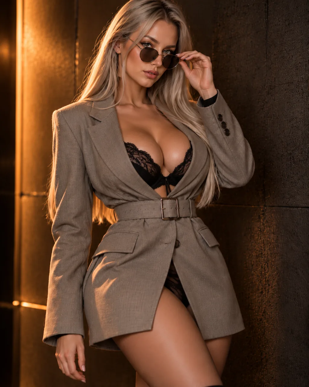
When looking at AI image services, distinguish the service's own claims from the visual examples used to introduce it. A polished gallery can tell you something about the publisher's taste and the kinds of scenes being presented. It does not, by itself, establish typical quality, the amount of selection involved or how a different brief would behave. A comparison that mixes a carefully chosen promotional image with an ordinary draft from somewhere else is not a balanced practical test.
Our approach here is to explain comparison questions, not to invent answers from screenshots. What was the intended scene? Was the image subsequently edited? Does the page explain the conditions under which an example was produced? Those questions become useful when actual documented information is available. Where it is absent, describe the visible composition and leave the unsupported claim open. A reader should be able to tell when a paragraph is making a visual observation and when it is discussing something that would need separate provider documentation.
A provider in the wider picture
Clothoff is the commercial reference for this edition. The sponsored link in this section leads to the provider's own website, where its current descriptions and conditions can be examined. We have not carried out a hands-on test of the service for this publication. The link should therefore be read as a reference to another website, rather than a score, a certification or a statement that the editorial illustrations were made there. For the provider’s own information, see Clothoff (sponsored reference).
If a provider interests you, keep the creative brief specific. An abstract request for something striking leaves too much room for incompatible interpretations. A brief about a fictional adult portrait can identify the framing, background and intended publication format without making claims about a real person. Check current information about permitted use, personal information and the handling of submitted material before deciding whether an external service belongs in a project. This journal does not accept photographs or process images on a visitor's behalf.
Captions carry the connection
A caption should help the reader understand why an image appears at that point in the feature. Naming the visible colour can be useful when colour is the subject. Repeating the headline beneath a portrait usually adds little. A stronger caption identifies the specific relationship: the dark background gives the bright sleeve a clear edge, or the wider framing leaves enough room to understand the gesture. This gives the next paragraph somewhere concrete to begin.
Keep the caption proportionate to the evidence. An illustration can demonstrate an editorial choice without demonstrating a commercial product's performance. If the scene is fictional, say so naturally. If the article uses two unrelated portraits to discuss framing, do not describe them as a controlled before-and-after result. A small, accurate caption does more for a feature than a dramatic claim the image cannot support. On mobile, keep the caption visually attached to its own picture so that a nearby heading does not accidentally suggest another meaning.
Arrange a short feature before a long gallery
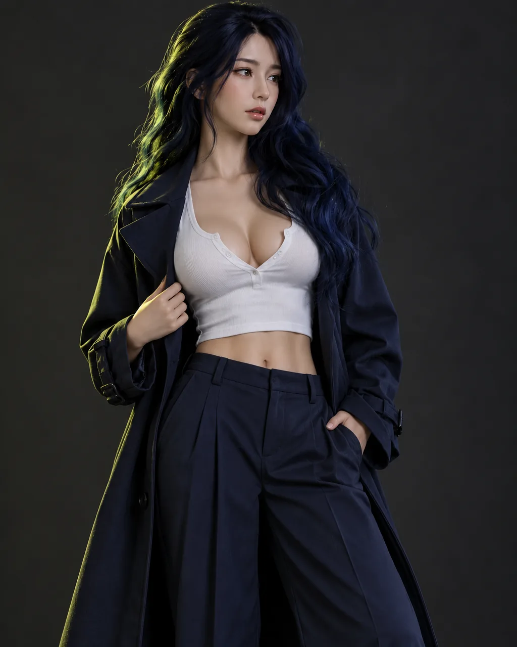
For a small publication, a compact sequence can be more useful than an enormous gallery. Choose an opening, one explanatory image and a closing frame. Put a paragraph between them that explains how the visual question changes. This reveals missing steps quickly. If the middle image cannot connect the introduction to the conclusion, adding six more images is unlikely to solve the underlying problem. The sequence needs a clearer argument first.
Once the three-image version works, consider whether another frame adds a distinct role. It might show a contrasting background, isolate a texture or make a framing comparison easier. Keep it only when that role is genuinely different. The principle also helps avoid repeated photographs across a small site: a dedicated article should receive images selected for its own question, rather than inheriting the homepage's illustrations. Readers following an internal link deserve a closer look, not the same visual introduction in a new wrapper.
End on the idea that should remain
A closing frame does not need to be the loudest image in the collection. It can resolve the question introduced by the opening: a calmer composition after a study of busy backgrounds, or a closer portrait after an explanation of distance. What matters is the relationship between the last image and the final paragraph. The picture can make the conclusion easier to remember, while the text explains the choice without assigning an invented result to a provider.
The companion essay develops this process through a fictional three-frame portrait assignment. Read it for a more detailed discussion of openings, transitions and the final crop, then return to this edition to compare the roles of the different photographs. A sequence is finished when each frame contributes something the others do not. That is a more practical stopping point than filling a page with every attractive image in a folder.